Project Overview
The problem:
Users often felt unhappy about the lack of available seats on arrival. They complained that they could not easily access information about the latest projects and events organised by the social enterprise.
The goal:
To redesign the journey related to points in the Vitality programme to enable the users to easily find and access information, resolve their points queries.
The product:
I’ve designed two new webpages and redesigned existing points pages to enable members to streamline the troubleshooting, simplify evidence submission journey, clarify the points earning activity page. The desired outcome was reduced negative sentiment from existing members through better digital experience.
The user research was conducted through interviews conducted in-person to gain deeper understanding of the needs of the users. The most common pain point identified was the fact that points were not showing up on the points statement and users were frustrated by lack of clear guidance on the next steps. The users felt a clearer process to retrieve the points is needed.
Project Time
September 2022 - February 2023
My Role
Content Designer
Responsibilities:
User research, usability study, content design, stakeholder managements
ideation, testing and
iterating on the design,
USER RESEARCH
User Personas and Problem Statement
User Journey MAP
Mapping out the user journey helps empathise with the user and spot improvement opportunities.
Key pain Points
Lack of readily available information on the upcoming events.
Engaging with the web content is not easy due to the layout and colours.
No features enabling users to book a table.
Crazy Eight
Crazy Eights helped me generate some initial ideas to solve challenges identified in the user research. It was a good exercise to start my design thinking process and develop user-centred designs.
SITEMAP
Planning out the architecture behind the website design, I created a clear organisational structure. Thanks to this, users can move through and use the website successfully. While conducting research during the empathize phase of the design process, I learnt that users wanted to be able to book tables and check the current projects easily therefore, I've included them in the main navigation menu for fast access.
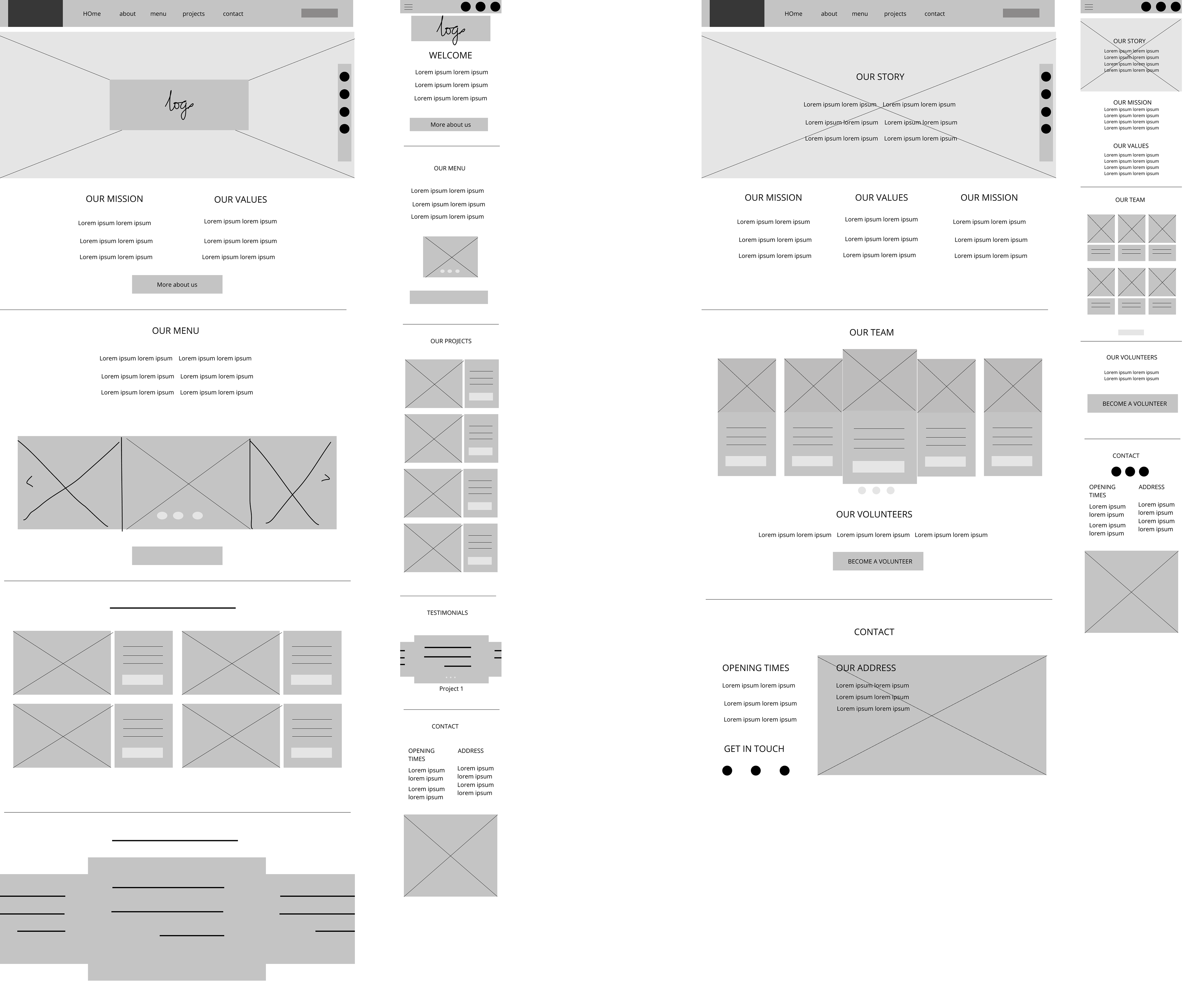
Paper wireframes and lo-fi prototype
Taking the time to draft iterations for each screen of the app allowed me to pick the elements that were the best-suited to address the user pain points and use them in the digital wireframes. For the home screen, I focused on the key activities that users wished to complete using the app (identified during user research) and made them accessible in the top navigation menu.


usability study
Testing usability with a group of users uncovered issues with the initial design. I have used the feedback gathered during the usability studies and implemented changes in to the design.
BEFORE
AFTER


MOCKUPS
accessability considerations
> Contrast - ensured AAA standard
> alt text included
> layout clear and logical with clear hierarchy
> typography - sans serif font type
> clear headings used to simplify page navigation